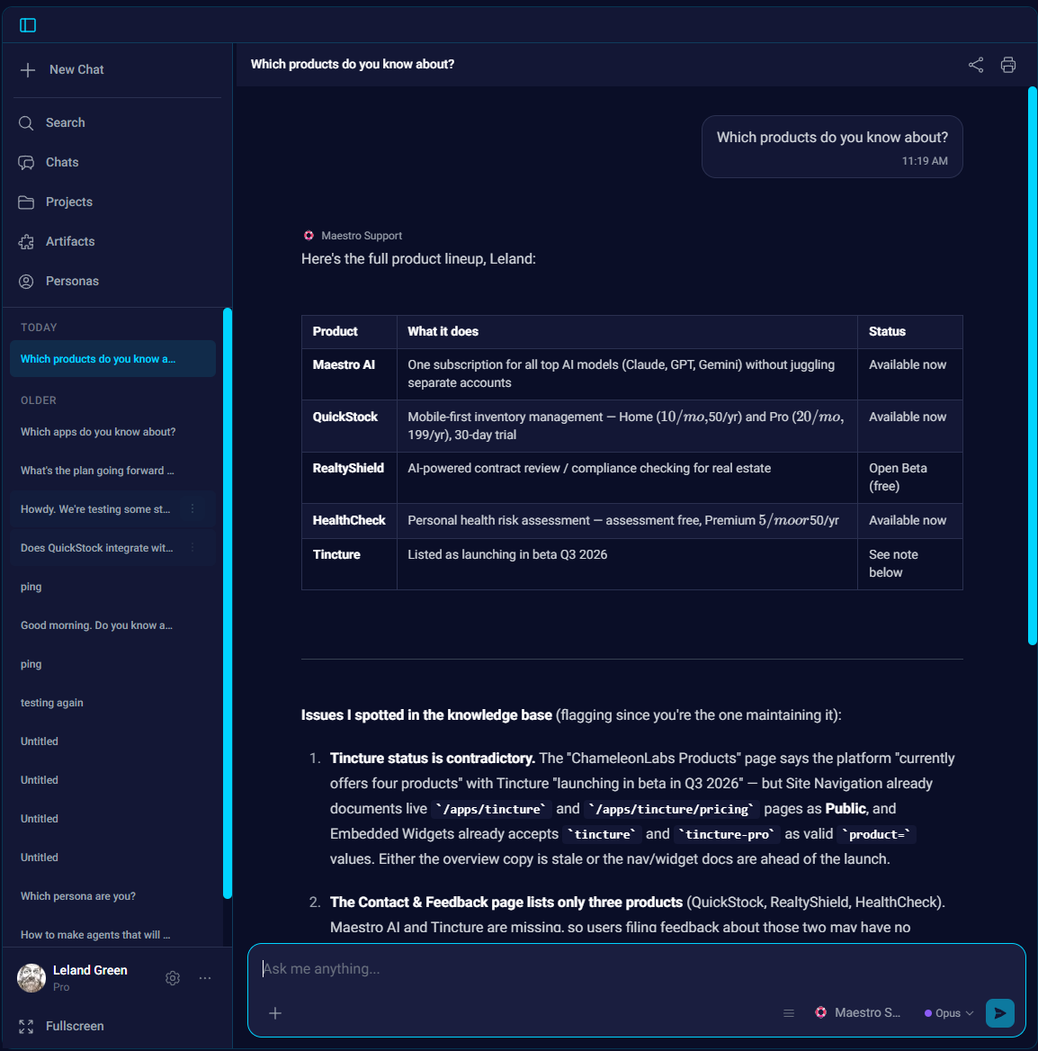
Maestro's chat picks up the Claude Desktop recipe (colors unchanged)
We restyled about 50 of Maestro's chat components to the Claude Desktop structural recipe: semantic tokens, border elevation and roomier typography. The cyan and navy didn't change.
One pull request merged this week. Just one, but it touched roughly 50 components, so it gets the whole post.
Here's the short version: Maestro's chat UI now follows the same structural recipe as Claude Desktop, and our cyan-and-navy color theme didn't change at all. We're calling it UI parity Phase 1. It merged August 15.
What actually changed
Semantic tokens, first. Before this, Maestro's chat components referenced specific colors directly, so any visual change meant a scavenger hunt across the codebase. Now a component asks for a role instead: surface, border, accent, muted text. The answer to each of those is still our cyan and navy, but the components no longer know that (or care). Next time we want to adjust the look, we change a token in one place instead of touching 50 files.
Elevation moved from shadows to borders. Claude Desktop separates surfaces with thin borders rather than drop shadows, and it's one of those choices you don't notice until you compare screenshots side by side. Drop shadows pile up fast in a busy chat thread. Borders keep everything flat and quiet.
The thread typography got the generous treatment too, with sizing and spacing tuned so a long conversation is comfortable to actually read.
And the avatars are gone from the thread. Every message used to carry one. But a chat with exactly two speakers doesn't need a portrait next to each message to tell you who's talking (you can tell, we promise). The thread breathes better without them.
Why we kept the colors
Structure and palette are separate decisions. We think Claude Desktop's chat is one of the most readable chat UIs around right now, and the readability comes from structure: how surfaces separate, how much room the text gets. None of that requires their colors. We like ours. So the design we picked (D2, if you ever find yourself in our design docs) borrows the structure and leaves the theme alone.
Process note, because we're proud of it: the design doc and the Phase 1 implementation plan were written and committed the day before the restyle merged, and they live in the repo next to the code. Future us always thanks past us for that.
Phase 1 of what?
The name gives it away. There's more parity work sketched out past the chat surface, but this blog only covers work that merged, so we'll write about the later phases when they ship. What we'll say now is that the semantic tokens only had to go in once. Everything after this builds on them.
If you use Maestro, open a conversation this week and see if you notice the difference. It should feel quieter. Tell us either way.